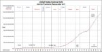
Yes, it looks bleak, but we need to see a graph of it against GNP which has grown exponentially, even since Reagan.
Keep the faith, and stay out of debt.
Scaling on the Y axis in not uniform and the Y axis should be plotted on a logarithmic scale. Another interesting number to plot would be the percentage of total tax revenues (Fed, state and local) vs. GDP over time.